________________________________________
Text
Add words and numbers to a drawing
Right-click Commands
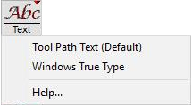
Windows True Type Text
Use the Text command to add text to a drawing. Use this for labeling a part, or for inscribing manufacturing information. Any True Type font installed on your system may be used in the Text command. True Type fonts may also be downloaded from the Internet or purchased from third-party vendors.
Letters are added as entities, so the font does not need to be installed on the system used to run the ProtoMAX abrasivejet. Once text is added, however, it cannot be "edited" as text (although you can select and erase it and add other text). After text is added to a drawing, all the LAYOUT commands may be used on it (such as Copy, Move, and Size).
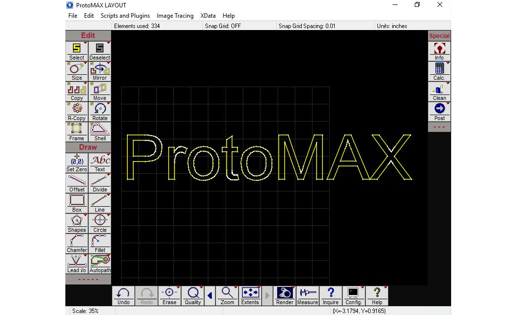
After adding the letters to a drawing, traverse lines must be added to the beginning and end of each letter.
Some fonts will use fewer entities than others. For best results you may want to "hand edit" the font to clean it up. Larger font sizes (such as 100) will give better results.
Entering True Type Text
1. Right-click the button and choose "Windows True Type" from the menu that appears.
The cursor changes to a large white I-beam cursor.
2. Position the cursor where the text is to begin and click the left mouse button.
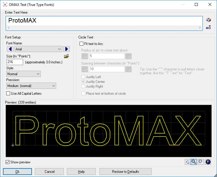
The OMAX Text dialog
Entering text
Enter text by typing it in the large center area. The text will appear as yellow letters. Enter as many characters as needed.
Copy and paste text from other Windows programs using the standard Ctrl+C (copy) and Ctrl+V (paste) shortcut keys.
Create multiple lines of text by holding down the Ctrl key and pressing Enter. Each time Ctrl+Enter is pressed, you move down half a line. To create a subscript, press Ctrl+Enter once. To create two normal lines of text, press Ctrl+Enter twice.
Enter letters outside the "normal" range by holding down the Alt key and typing the appropriate four-digit character number on the number pad. For example, to enter the copyright symbol, hold down the Alt key and type "0169." These four-digit character numbers may be found by starting up the Windows Character Map application. You can start this application by clicking on the key on the right side of the text window.
3. Click to enter the text into the drawing.
The text is placed as all traverse lines. Assign a Quality to the entities.
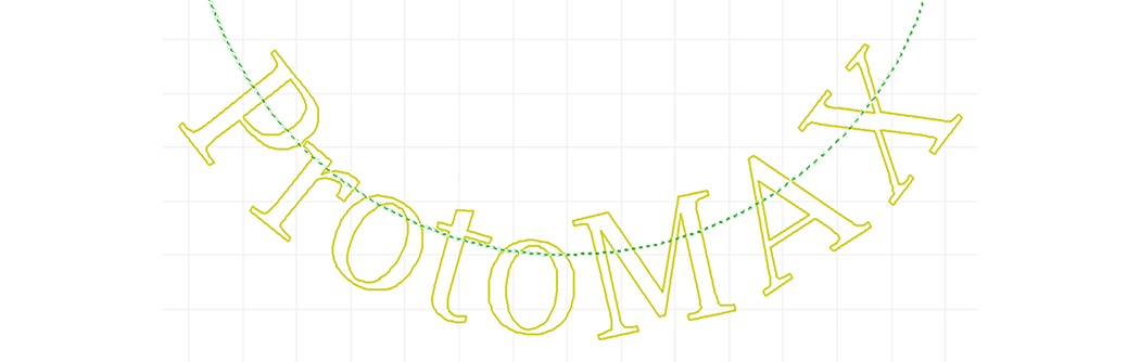
Example of text
Font Setup

Font Name
Choose the font in this drop-down list. Use the arrows on either side of the name to move quickly through your available fonts. As each font is selected, the preview text will change to show how it appears in that font.
NOTICE
The font you set affects all the characters you enter in the box. If you want to use more than one font, you will need to enter them as separate sets of text.
You can load a "temporary" font by clicking on the icon. This will let you choose a True Type Font on your system and will temporarily make it available to Windows. When you reboot Windows, the font will no longer be available. This is useful if you have many fonts, and don't want to take up system memory with those you use infrequently.
Font Size
The font size is measured in "points," a common typesetting measurement. There are 72 points in an inch (or about 28.4 points in a centimeter), so a font size of 36 will produce letters that are one-half inch tall. (The point size refers to the height of a capital "E," so not all letters will be one-half inch tall.)
If you need to enter very small text (less than 12 points), you may get better results by creating the text in a larger size and then using the Size command to make it smaller.
Font Style
There are four styles available for each font: Normal, bold, italic, and bold italic. Most fonts use characters specially designed for each of these styles. Some fonts, however, only modify the normal font to get bold and italic. The quality of the bold and italic characters in these fonts is not as good.
Precision
This affects how many entities are used to draw each character. A setting of "low" uses as few entities as possible to draw the characters--as a result, the characters are not as well shaped.
A "high" setting will provide well-shaped characters, but will also use many entities.
Use All Capital Letters
When this option is checked, all text will be converted to UPPERCASE characters. This is useful when you wish to quickly convert your text to all caps without having to re-type characters currently appearing in lower case.
Circle Text
You can enter text arranged around a circle by checking the option Fit text to Arc.
Example of circular text

Entering text
You enter text as you would regularly. The only difference is that you can adjust the spacing between the letters by using the carat (^) character. When the letters are spaced around a circle, some of them may be too far apart. Each carat you type moves the characters closer together. In typography, this is called kerning.
If you enter more text than there is room for on the circle, the text will overlap. You can fix this by either reducing the size, or by increasing the radius of the arc.
Radius of arc to rotate text about
This adjusts the size of the circle that text is arranged around. Small values (small circles) mean very circular text, while larger values flatten out the text. Typical values are between 4 and 20, depending on the amount of text, and the effect you want.
Spacing between characters
This lets you set the spacing between all of the characters in the text. Text arranged in a circle will tend to have too much space between some letters (depending on the size of the text, and the radius of the arc). This setting lets you adjust the spacing of all the letters. Negative values bring the letters closer together, while positive values spread the letters out.
Note that the spacing is in points, as is the letter size. Therefore, the effect will vary depending on the size of the text. If your text is 200 points, for example, each point change in letter spacing will have a small effect. If your text is 20 points, though, each point change will have a dramatic effect
Justify Left
Justify Center
Justify Right
These options control where the text is in relation to the top (or bottom) of the circle. When Justify Left is chosen, for example, the text begins at the top of the circle. Similarly, Justify Center will center the text at the top of the circle, and Justify Right will end the text at the top of the circle.
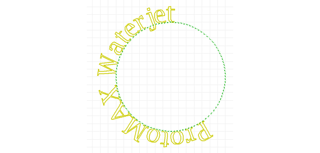
Text left justified
Place text at bottom of circle
This option reverses the curvature of the text by placing it at the bottom of the circle (it switches from concave to convex). The x-height is placed along the bottom of the circle (the x-height is the height of the lower-case "x" and is typically the same as the tops of lowercase letters).
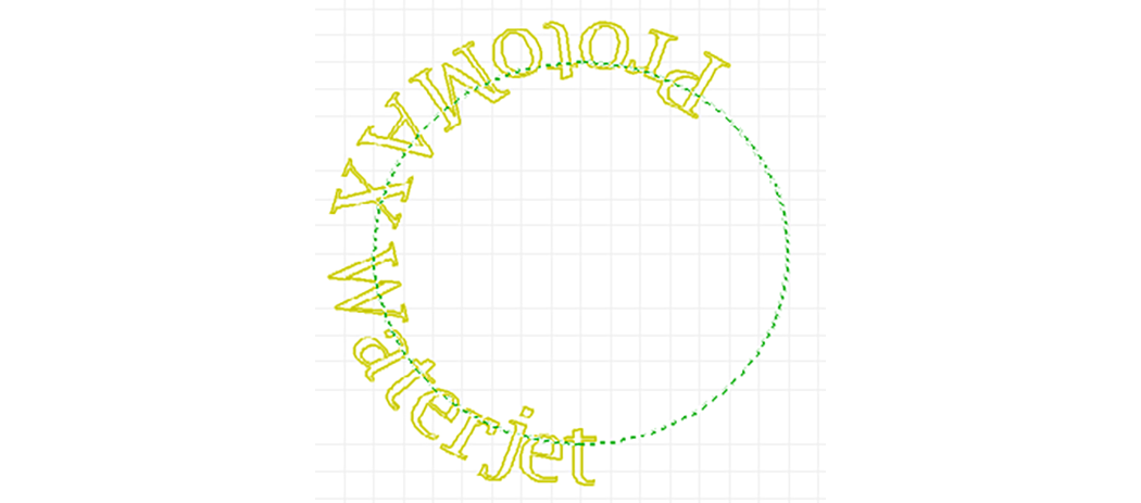
Text placed at the bottom of the circle
Error Messages
If an error occurs when entering in text, most likely the problem is one of the following:
- Unsupported font feature
A character in the font may have a complex shape that is not supported by LAYOUT . Although most standard fonts will work well with LAYOUT , it is possible some fonts will not. Try using a similar, but different, font.- Font file may be corrupt
This is very unlikely, but can happen. This means that, for some reason, the font file no longer contains correct information. This can be because of a hard disk problem, or because another program overwrote part of the font.
Check if the font file is okay by using WordPad, and creating text in the same font. WordPad will use the same font file as LAYOUT . If the font file is corrupt, it must be restored from a backup disk.
Tip: LAYOUT recognizes True Type Fonts. If you have a font in another format such as Open Type, there are free font converters on the Internet that can be used to convert them to True Type.
See Also: Tool Path Text